In the meat case, a package has about two seconds to say what’s inside and why it costs more than the one next to it. When Steakhouse Elite came to us, the beef was already premium. The package design wasn’t.
The old Kobe-Crafted Signature burger pack sat in an olive-bronze tray. It carried a lot of information, including a small crest logo, a banner, a script “Signature,” a big “Ground Beef Burgers” headline, four badges, a tagline and manufacturer details. Everything on it was accurate. But at shelf distance it read as a busy, mid-tier ground beef pack, not a steakhouse-grade burger.
Since the redesign, Steakhouse Elite is up 40% year over year at Publix, its largest retail partner.
What we changed
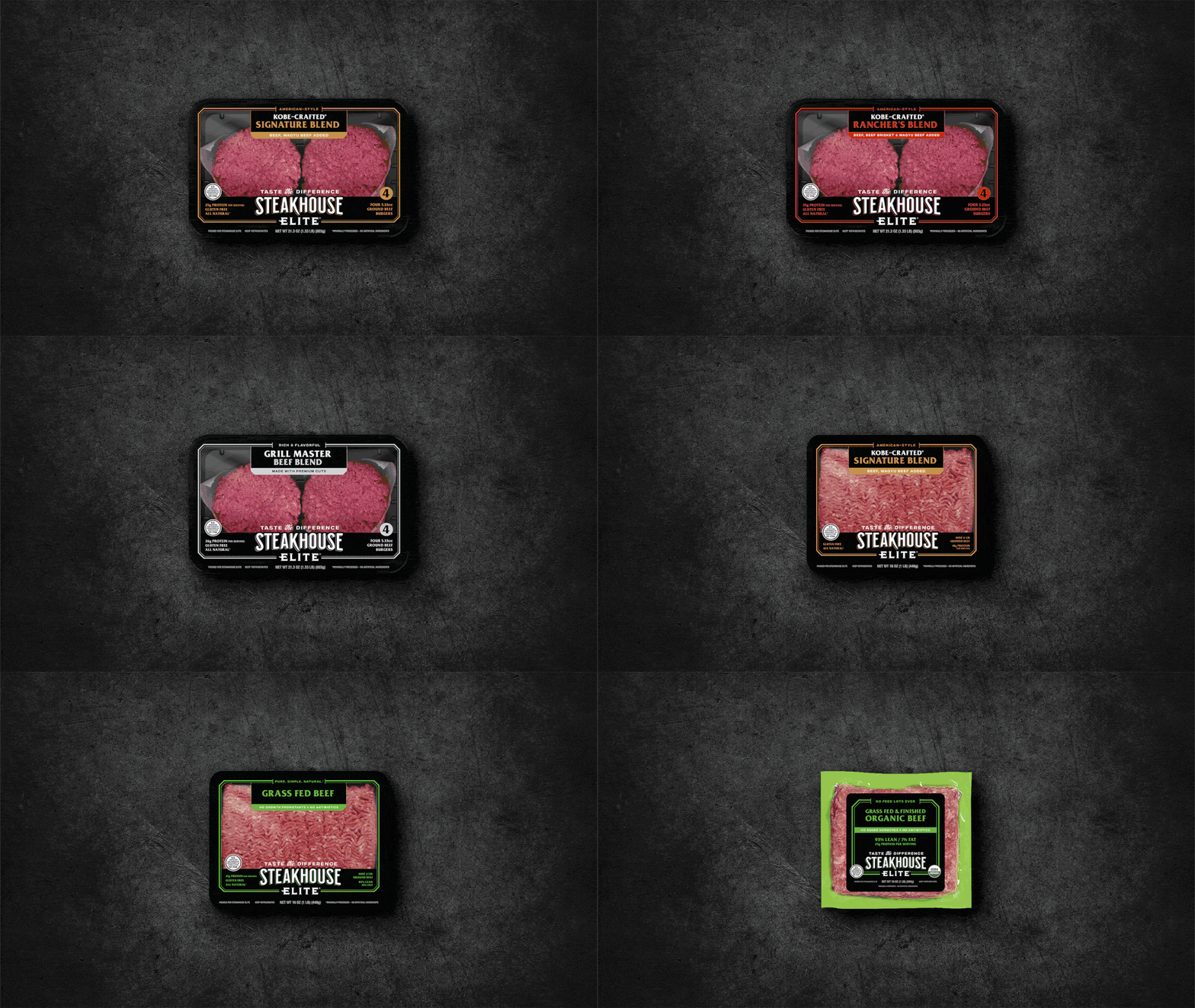
We went black. The muted bronze tray gave way to a deep black one with a fine gold keyline frame. Color is the fastest signal in the case, and black and gold say “premium” before a shopper reads a word. Against the pink of the beef, the pack now stands out in a case full of red, white and green.
We made the brand the hero. The small crest logo became an oversized, confident STEAKHOUSE ELITE wordmark. Shoppers can now find it, name it and come back for it.
We cut the clutter. The old front panel was crowded with badges, a tagline and fine print. The new one keeps three short claims (protein, gluten free, all natural) and moves everything else out of the way.
We gave the product claim a proper nameplate. “Kobe-Crafted Signature Blend” now sits in its own black-and-gold label, with “Wagyu Beef Added” underneath. It reads like a menu line at a steakhouse, which is the idea.
We made the pack easier to understand. A clear “4” count badge and “Four 5.33 oz Ground Beef Burgers” tell shoppers what they’re getting at a glance. “Taste the Difference” gives them a reason to try it.
Why it worked
The beef didn’t change. What changed was how clearly the pack communicated its value. Shoppers decide at the case in seconds, and a pack that looks like what it contains makes that decision easier. Premium products have to look premium, or shoppers don’t believe the price.
That’s the idea behind Retail Brand Fuel: design that earns its place on the shelf. If your brand is better than your package, we should talk.